A local-first, PWA-ready project-management and personal-operations tool for independent creative studios.
A local-first, PWA-ready project-management and personal-operations tool for independent creative studios.
iterations
browser refreshes
hours of prompts and respponses
summit reached
Studio OS is a single-user, offline-first application that unifies the operational life of an independent creative professional: client projects and their revision rounds, deliverables with versioned client feedback, time and budget, invoicing and personal cashflow, and a personal layer of to-dos, habits, goals and journaling. It is built as a local-first PWA (data in the browser via IndexedDB, assets in the Origin Private File System) with optional CouchDB sync for true multi-device use.
This report documents the UX process behind the product: who it is for, what they need, how the design was researched and validated, and how the artifacts: personas, journey map, wireframes and prototype, connect to one another.
A local-first, PWA-ready project-management and personal-operations tool for independent creative studios.
Independent creatives operate a whole business alone, yet their tooling is fragmented: a task app, a spreadsheet for money, scattered email/Figma feedback, and sticky notes for ideas. The needs below were distilled from the research in Section 3 and mapped to the underlying goal and the product response.
|
User need |
Underlying goal |
How Studio OS addresses it |
|---|---|---|
|
“See where each project stands without digging.” |
Reduce cognitive load & context-switching |
Phase pipeline + a Today dashboard aggregating due items, cash and goals |
|
“Stop unbilled scope creep.” |
Protect profitability |
Revision rounds as first-class objects; time logs roll up per round |
|
“Know if a project actually made money.” |
Financial clarity |
Fixed/hourly budget model: quote vs. effort + expenses = margin |
|
“Manage feedback on each version in one place.” |
Tame the review loop |
Deliverables → versions → threaded client/studio feedback |
|
“Understand my runway, not just project income.” |
Personal financial stability |
Cashflow projection from invoices + recurring expenses + other income |
|
“Capture ideas and stay consistent.” |
Sustain personal practice |
Idea inbox, habits with streaks, journal, weekly review |
|
“Work across my laptop and phone.” |
Continuity |
Local-first data with optional CouchDB sync; mobile-first layout |
Goal: understand how solo creatives actually run their studios before committing to a solution.
Methods:
Key findings:
Ownership matters. Several participants were wary of cloud lock-in and wanted their data portable.
Goal: validate that the proposed model (phases, rounds, deliverables, unified finance) is usable and matches real workflows.
Method: moderated usability sessions on the working prototype, five core tasks, think-aloud, with a simple severity scale (1 cosmetic – 4 blocker).
|
Task |
Result |
Finding |
Severity |
|---|---|---|---|
|
Open a revision round and log time to it |
Pass |
Round-as-object was immediately understood and welcomed |
— |
|
Tell whether a fixed-fee project is still profitable |
Pass (with a pause) |
Users wanted the margin figure more prominent |
2 |
|
Attach a new version and leave client feedback |
Pass |
Version → feedback thread matched mental model |
— |
|
Find runway for the next 3 months |
Partial |
Users expected goals to be period-scoped, not lifetime |
2 |
|
Switch projects on a phone |
Fail → fixed |
Sidebar list was unreachable on mobile |
3 |
Actions taken: margin surfaced in the budget header; goals were period-scoped to year/quarter; a mobile bottom tab bar plus a horizontal project switcher replaced the desktop sidebar on small screens.
Even a solo tool has a small constellation of stakeholders. Mapped here by their interest in the product and their influence over its success.
|
Stakeholder |
Role / interest |
Influence |
Engagement |
|---|---|---|---|
|
Studio owner (primary user) |
Runs the business; lives in the tool daily |
High |
Co-designs; drives every decision |
|
Clients |
Receive deliverables, give feedback, pay invoices |
Medium |
Touch the feedback & (future) review-link flow |
|
Contractors / collaborators |
Occasional help on larger projects |
Low–Medium |
Future shared-access consideration |
|
Accountant / bookkeeper |
Consumes financial output at tax time |
Low |
Benefits from export; not a direct user |
|
The maker (HyperGraphik) |
Designs, builds and self-hosts the product |
High |
Owner-operator of code, design & sync infra |
Power/interest read: the studio owner sits top-right (high power, high interest) and is the design north star; clients are mid-interest and engaged only at the feedback boundary, which is exactly where the service blueprint focuses.
Two personas, both 30–40 and running creative practices, bracket the audience: an established studio owner focused on profitability and control, and a freelancer-becoming-studio focused on stability and collaboration.
|
Daniel Cruz — 37 — Founder & Creative Director One-person brand + web studio · Greater Toronto Area |
|
|
Snapshot |
Runs a solo studio after a decade agency-side. Designs and builds (brand systems, WordPress/ACF sites). Bills a mix of fixed-fee and hourly. Comfortable technically; protective of his time and margins. |
|
Goals |
Know each project’s profitability in real time Contain scope creep across revision rounds See business and personal cashflow in one place Spend less time switching between tools |
|
Frustrations |
Stitching Asana + spreadsheets + email feedback together Discovering a project lost money only after delivery Clients re-opening “finished” work without it being billed |
|
Behaviors |
Thinks in phases and rounds, not tickets Wants production-ready output, not partial drafts Reviews finances weekly; anxious about quiet months |
|
Needs the product meets |
Revision rounds with time/$ rollup Fixed/hourly margin at a glance Unified finance + runway Fast capture so nothing is lost |
“I don’t need another to-do app. I need to know if this project is making money before it’s over.”
|
Maya Okafor — 32 — Freelance Designer (studio-in-the-making) Freelance brand & motion · works with 1–2 contractors · mobile-heavy |
|
|
Snapshot |
Three years freelance, starting to subcontract and think like a studio. Design-strong, less developer. Income is irregular; works across laptop and phone, often on the move. |
|
Goals |
Smooth, centralized client feedback Stabilize feast-or-famine income Build consistent working habits Never lose a fleeting idea |
|
Frustrations |
Feedback scattered across email and design-tool comments Cashflow anxiety between projects Inconsistent routines; ideas lost in notes apps |
|
Behaviors |
Collaborates with contractors on bigger jobs Captures ideas on her phone between meetings Checks in on goals and habits to stay grounded |
|
Needs the product meets |
Deliverable versions + one feedback thread Cashflow projection & runway Habits, journal, weekly review Genuinely usable mobile layout |
“Half my work happens on my phone between calls. If I can’t capture it there, it doesn’t exist.”
End-to-end journey for Daniel running a fixed-fee client project through Studio OS — the product’s spine. Emotion is charted from low (✖) to high (✔).
|
Stage |
Doing |
Thinking / feeling |
Pain point |
Opportunity |
|---|---|---|---|---|
|
Kickoff |
Creates project, sets quote & phases |
“Let’s start clean.” (✔) |
Setup friction in generic tools |
One screen to define project + budget |
|
Production |
Logs time, advances phases, uploads versions |
“Am I on track?” (≈) |
Effort vs. fee invisible mid-project |
Live margin in budget header |
|
Revision |
Opens rounds, collects client feedback |
“Is this still in scope?” (✖) |
Unbilled scope creep |
Time + $ rolled up per round |
|
Delivery |
Marks approved, sends final invoice |
“Did this pay off?” (≈→✔) |
Profit unclear until later |
Margin + invoiced/collected on the project |
|
After |
Reviews finance, runway, weekly review |
“What’s next, and am I okay?” (✔) |
Business vs. personal split across apps |
Unified Finance + Today dashboard |
Low-fidelity layouts established structure and hierarchy before any styling, validating the information architecture (nav model, dashboard aggregation, project sections) cheaply.
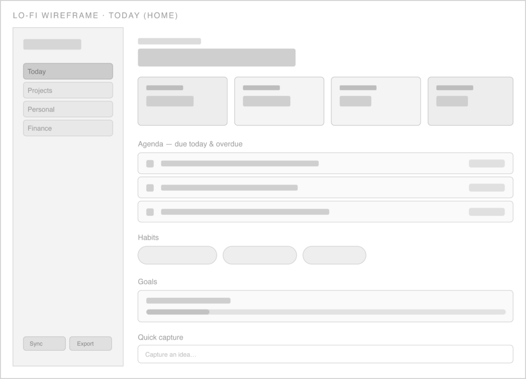
Lo-fi: left nav, greeting, four KPI cards, agenda, habits, goals, quick capture.
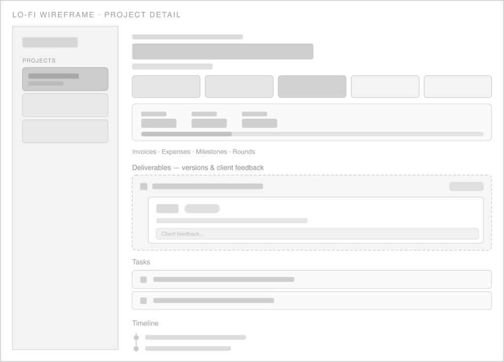
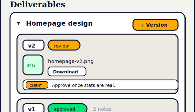
Lo-fi: phase pipeline, budget block, and the deliverables → version → feedback module (dashed = newly introduced flow).
High-fidelity screens apply the “Pop Block” system: bone canvas, navy outlines with hard offset shadows, neon green for active/positive states, gold as a warm tertiary, and an editorial serif for headings. The Today screen below is also a static capture of the working prototype’s home.
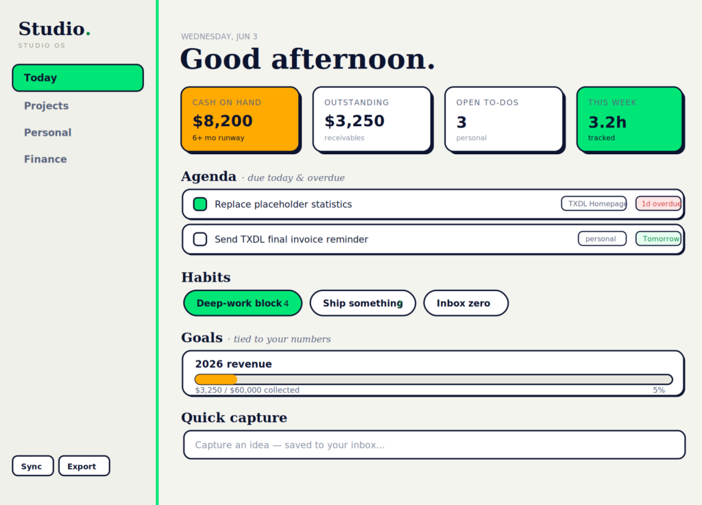
Hi-fi: Today (home) — also the prototype’s live home screen.
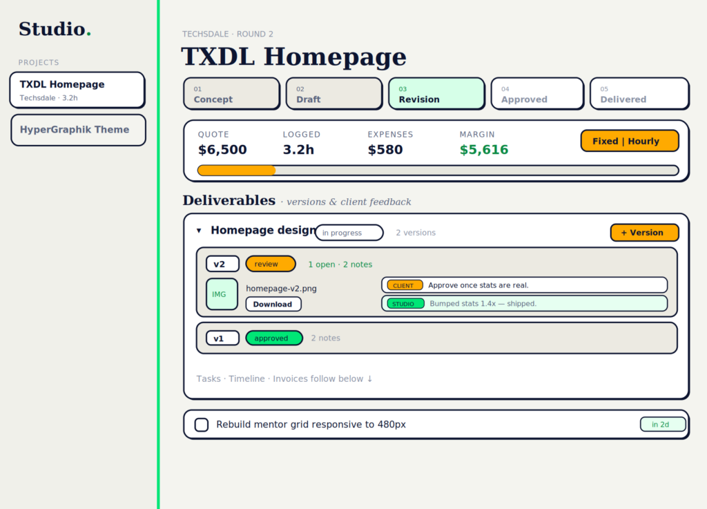
Hi-fi: Project detail — phase pipeline, billing-aware budget, and the deliverables/versions/feedback module.
The one genuinely multi-actor flow. The blueprint adds the backstage to the journey: what the client sees (frontstage), what the studio owner does, and the systems beneath the line of visibility.
|
Layer |
Submit version |
Client reviews |
Feedback logged |
Resolve & re-version |
Approve |
|---|---|---|---|---|---|
|
Client action (frontstage) |
Receives version/link |
Views asset, comments |
— |
Sees updated version |
Confirms approval |
|
Line of interaction |
——— |
——— |
——— |
——— |
——— |
|
Owner action (backstage) |
Uploads asset, sets ‘review’ |
Shares with client |
Tags note client/studio |
Edits, adds ‘v2’ |
Sets ‘approved’ |
|
Line of visibility |
——— |
——— |
——— |
——— |
——— |
|
Systems / support |
OPFS asset store + version meta |
Render thumbnail |
Feedback collection (synced) |
Version factory, soft-delete |
Status cycle; goal credit |
Where it pays off: the blueprint exposes that “client reviews” currently happens outside the app (email/link). That points directly at the next build — a read-only client review link — which the data model already supports.
The product was built through tight designer–maker collaboration, mirroring how the studio owner already works with clients: propose options, select a direction, then iterate with precise feedback.
Production-ready increments. Every round delivered a complete, runnable artifact, keeping the prototype continuously testable.
The prototype is a working, self-contained PWA — not a clickable mock. It runs the real data model and interactions:
Because the prototype is real, evaluative research ran against actual behavior (persistence, timers, budgets, feedback threads) rather than a facsimile — making findings directly actionable.
Prepared as a UX process report for Studio OS.
The final design delivers a funky yet minimal PM tool. The UX process was pivotal in streamlining the features that were developed,resulting in a smooth and intuitive interface.